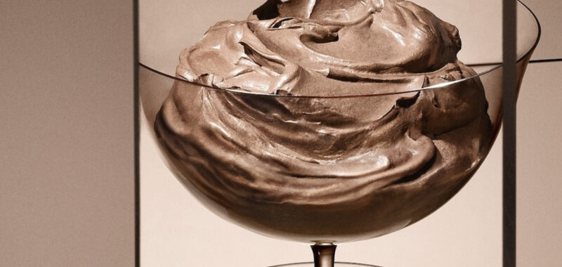
The Pantone Color Institute has unveiled its pick for 2025 Color of the Year: Mocha Mousse. Succeeding this year’s selection of a semi-optimistic Peach Fuzz, Mocha Mousse is exactly what it says it is — a light, sweet, creamy brown with a warm undertone. This is the first time Pantone has chosen a shade of brown for the distinction, not counting the earthy reddish-brown Marsala of 2015.
As it tends to happen with matters of personal taste, Pantone’s Color of the Year (and occasional tandem picks) has been contentious since its inception in 2000, even sparking an online conspiracy theory about the selection process last year. Today alone, people have been coming out in droves to express their deep-seated hatred for or utter confusion about Mocha Mousse in various comments sections. USA Today even insinuated that Brat green had been snubbed in favor if the more “demure” milk chocolate tone.
Pantone maintains that it selects the annual color based on world events, attitudes, and trends. This year, the institute’s Executive Director Leatrice Eiseman explained in a press statement that Mocha Mousse “expresses a level of thoughtful indulgence,” calling the color “sophisticated and lush” as well as an “unpretentious classic.”

I’m not one for following trends in luxury goods, fashion, cosmetics, or home goods by any means, so I can’t really opine on how Mocha Mousse is slated to impact the consumer market in any way whatsoever — nor do I really care that much in the first place. I do, however, find it a bit odd if not side-eye worthy that so many people can’t fathom looking at a shade of brown without likening it to poop.
In my mind’s eye, Mocha Mousse brings about the softness of a plush teddybear. A silky, creamy Dunkin’ hot chocolate (born and bred Masshole here). A velvety suede on a favored pair of boots. The frothy frosting that fuses layers of chocolate cake together. The mushy organic clay taken from riverbanks to siphon impurities from our skin in face masks. The highlights on the fuzzy feathers of beloved Kiwi birds.
And quite frankly, Mocha Mousse runs a little bit more personal for me as both a color and a name. Since I have the opportunity to pontificate in my own thinkpiece, I’ll say that I’ve been wearing foundations, eyeshadows, concealers, lipsticks, and even nail polishes in similar shades of “Mocha,” “Chocolate,” “Cocoa,” “Cappuccino,” and other decadent drink or dessert titles for over a decade now. Those are the titles cosmetic brands have assigned to my skin color and the shades closest to it.


I’m well-aware of the politics of objectification, fetishization, and consumption that surround these names, but if I have to be objectified, I much prefer being likened to a sweet treat over having my skin tone called “shit brown,” “diarrhea brown,” or “dirt” — all of which I’ve been faced with throughout my life.
Dirt or excrement might be brown, but not all browns can be compared to dirt or excrement. Urine is (hopefully) yellow, but do you point at a buttercup or taxicab and wrinkle your nose? Blood and scabs are red … Hell, Pantone even developed its own “Period Red” (it’s just plain red) in acknowledgement of the stigma surrounding menstruation. But do you look at red velvet cake or rose petals and shudder a little bit?
I get that it’s not that serious, but I am always unfortunately attuned to the manner in which people respond to the color brown being that I wake up and look in the mirror every day as a Perpetually Offended Brown Person™.
The only thing I find egregious about this year’s color campaign is the supporting AI-generated imagery for Mocha Mousse, which is inexplicably but profoundly sinister in a way I cannot easily find words for. I guess you could say I just don’t like that shit … 🤷🏾♀️

